For the first week we had to copy an existing artwork using our chosen technique. I chose »Blossom« by Max Machen and duplikatpress.
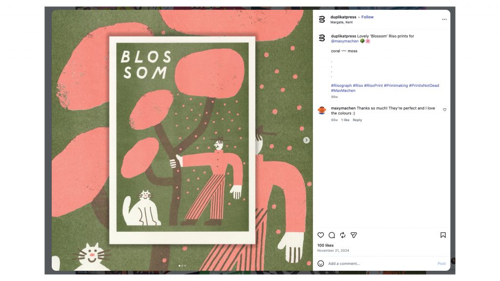
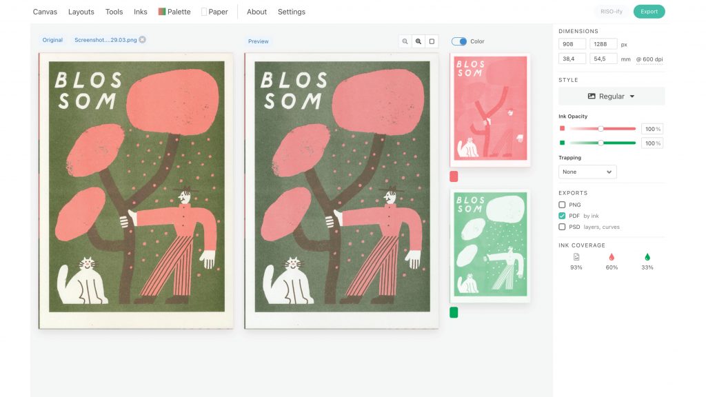
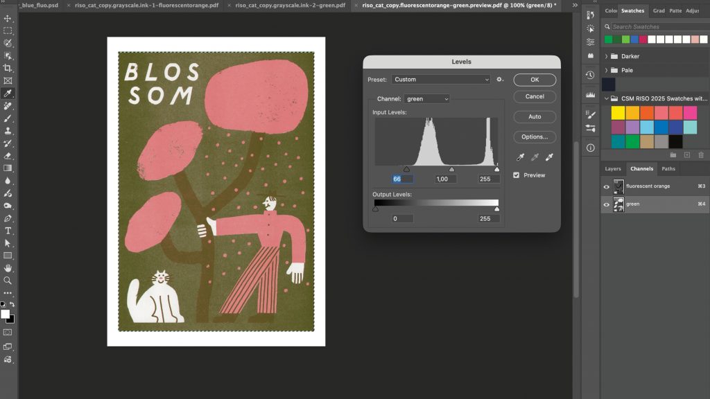
Through copying I learnt how to separate the layers, individually tweak them and get them ready for print. I also quickly realised that it takes many test prints to line the layers up correctly and get a final print. In short: a lot of labour goes into riso printing.
As I had extra time during my riso slot, I also printed a calligraphy piece of mine. Without intending to, the unevenness of the inks caused an interesting colour effect, highlighting these »faults« instead of concealing them. I found this very interesting and kept it in mind while forming my critical questions.
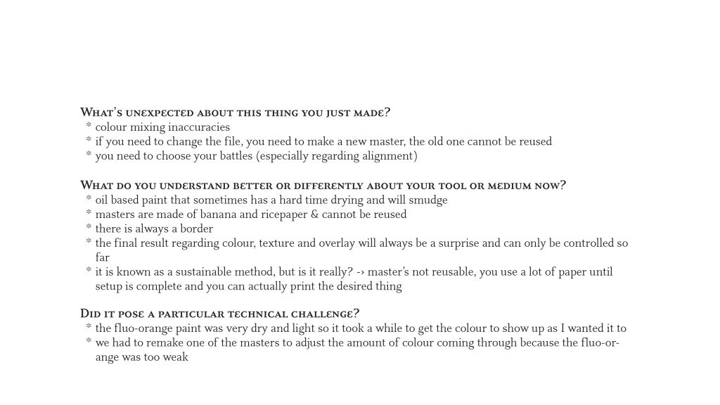
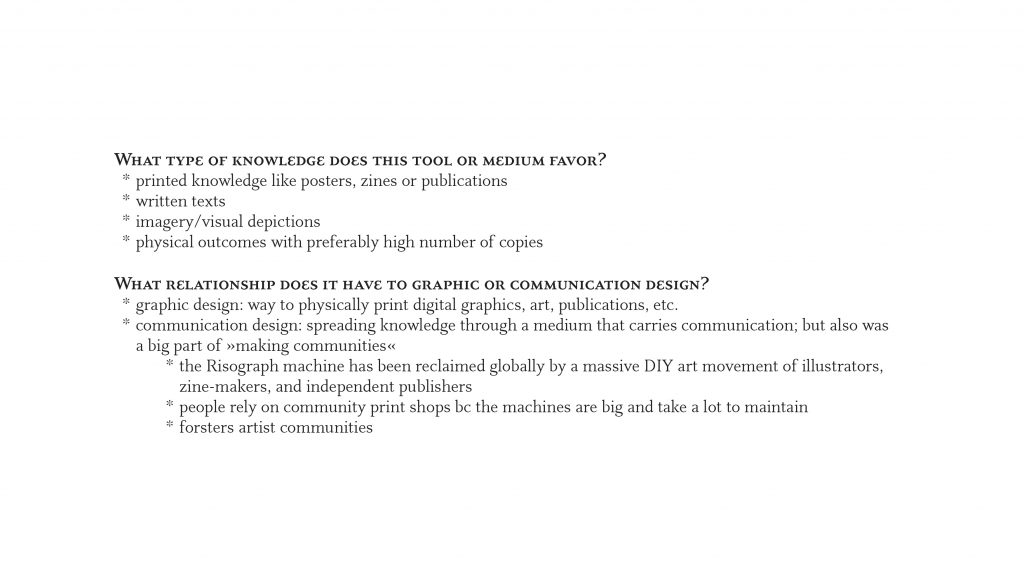
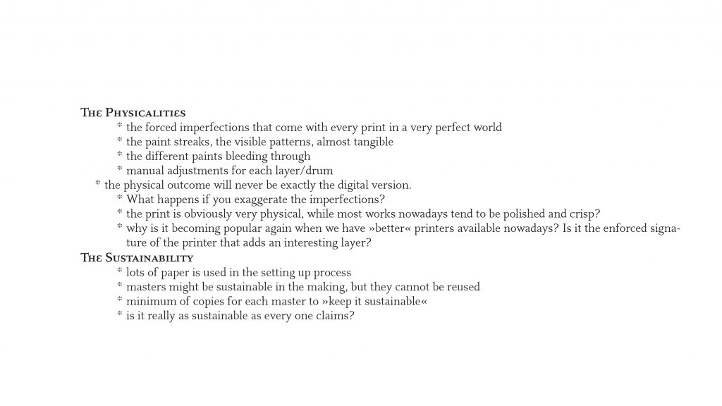
I had no definite critical question at the end of week 1, but two main interests that I wanted to explore further: the physicalities and the sustainability of riso print. This, as well as some feedback from the tutorial such as »how do people judge different visual versions of it?« »what can I do and what can’t I do?« and »can I replicate the inaccuracies of the calligraphy print?« informed my work during the second week.
Leave a Reply